
COLOUR COORDINATION - MADE EASY!
HISTORY
A colour wheel was first developed by Sir Isaac Newton in his 1704 book Opticks. Later he created an Asymmetrical colour wheel with seven colours - red, orange, yellow, green, blue, indigo, and violet.
In 1810, Johann Wolfgang von Goethe developed a symmetrical colour wheel with just six colours (eliminating indigo) that is similar to the one we commonly use today.
Artists and fashion designers use colour wheel to create colour schemes that produce a desired artistic effect.
What Are Primary, Secondary, and Tertiary Colors?
So first the color wheel is anchored by three primary colors that form a triadic color scheme. In the traditional RYB color model, these primary colors are red, yellow, and blue. You can mix the primary colors to form secondary colors: green, orange, and purple. Mixing a primary color with a secondary color result in a tertiary color: magenta (red-purple), vermillion (red-orange), amber (yellow-orange), chartreuse (yellow-green), teal (blue-green), and violet (blue-purple).
What Is Color Theory?
Here is the most important key, the Color theory is a set of guidelines for mixing, combining, and manipulating colors. If you have got this then you are ready to go. Color theory includes ideas like:
- Color harmony: It is the sense of visual order when the colour pairings are visually pleasing. Color schemes based on complementary and analogous colors are generally perceived as harmonious. But, since humans respond to colors differently depending on personal preferences and life experiences, there are no universally “right” colors for achieving harmony.
- Color temperature: Color temperature deals with breaking colors down into warm colors (associated with sunset and daylight) and cool colors (associated with overcast light). Experimenting with combinations of warm and cool colors can help you mix colors to achieve a particular effect.
- Color context: Colors appear to behave differently when viewed in different contexts. For instance, a rusty orange may seem dull and subdued when placed beside a vivid yellow, but when paired with a dark purple, the orange suddenly seems much brighter.
Don't go shilly-shally about what to match and land up on your go-to neutral looks and dive into this color style guide to revamp your wardrobe with these daring color combos.
We all tend to divert back to neutral colors because simple is a welcomed sentiment. The idea that everything goes with black or white is a phenomenal routine to wrap your head around, and with everything else that goes on in your life, simple is a welcomed sentiment. But what if you want to step out of your comfort zone and try something more colorful? To style your outfit with an exquisite harmony of colours is anything but simple. I know that most of us do not have a color wheel on hand to double-check the harmonious consonance of our selected hues.
So let me make it easier for you today!
Let's simplify this with the basics of color theory, the key color combinations that are essential to the assembling of any vibrant or simple outfit to master even for the most novice soul among us.
The different categories of colour combinations you can use in your outfit styling are — analogous, complementary, triadic, tonal, monochromatic. Note that the first three color combos (analogous, complementary and triadic) can be worn with shades of white, gray, or black in your outfit since those are visual “void of color” neutrals that don’t count as colors themselves. But the last two color combos (tonal and monochromatic) have a more narrow color focus so they don’t usually lend themselves to adding neutrals in the outfit.

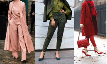
How to Style Complementary Colours
As the name itself says it all, these colours compliment each other. These are hues that are placed opposite to each other on the colour wheel.
The fact that opposite's attract is appropriate for the vibrant pairing of these combinations.
For example blue and orange, purple and yellow, red and green. The effect is a popping contrast of color that creates a sometimes electric, high-voltage look!
It's a picturesque styling with these colour pairings.
There is an enthralling vibe when these combinations are worn together. So if you are a beginner at these experimentations then to make it easier and comfortable at the beginning I would suggest that you start with lighter shades like pastel purple and yellow. Eventually, you will start enjoying the play of colours and brighter aesthetics then you can go ahead for more exuberant colour schemes like burnt orange and electric turquoise. The zestful nature of these blends makes them eccentric and experimental further.


How to Wear Analogous Color Palettes
The styling of the Analogous colour palette is effortlessly beguiling. It creates more depth into the whole look styled. Analogous colors are shades that are adjacent to (next to) each other on the color wheel. They align the shades in soft gradation seamlessly.
Pick a base colour and build upon with the adjacent colours to get the cohesive and perfect blend.
For example pink and red; blue and purple; green and blue; orange and burgundy.
However, if you were to ask who looks amazing in an analogous colour scheme, I would say those who have a low contrast level in their natural colourings. In other words, if there isn’t much contrast between your hair, skin colour and eye colour (usually Summer and Autumn skin tones) then analogous colours look great on you as you appear more blended in your appearance. Example: If you have a vast difference in your hair colour and skin i.e: dark hair and pale skin, then more contrast colours will make you look better.
But don't you worry, you can style the colours you like according to the proportion that goes with your natural skin tone by using different accessories like footwear, purse, sunglasses, earrings, etc.


How To Style Triadic Color Combinations
Triadic colours are three colors spaced equally apart on the color wheel. Being equidistant on the color wheel, these colors balance each other and create harmony. Think combinations of orange, purple, and green (secondary colors) or yellow, blue, and red (primary colors). These pairings are also loose guidelines when building out your look and can be adjusted based on the shade or hue you’re focusing on.
They look great together, but some might argue that they can be OTT. However, you can choose the muted shades of these colors to make your outfit. A pair of green cargos with a pastel pink top and powder blue accessories or shoes will look sophisticated and tasteful.


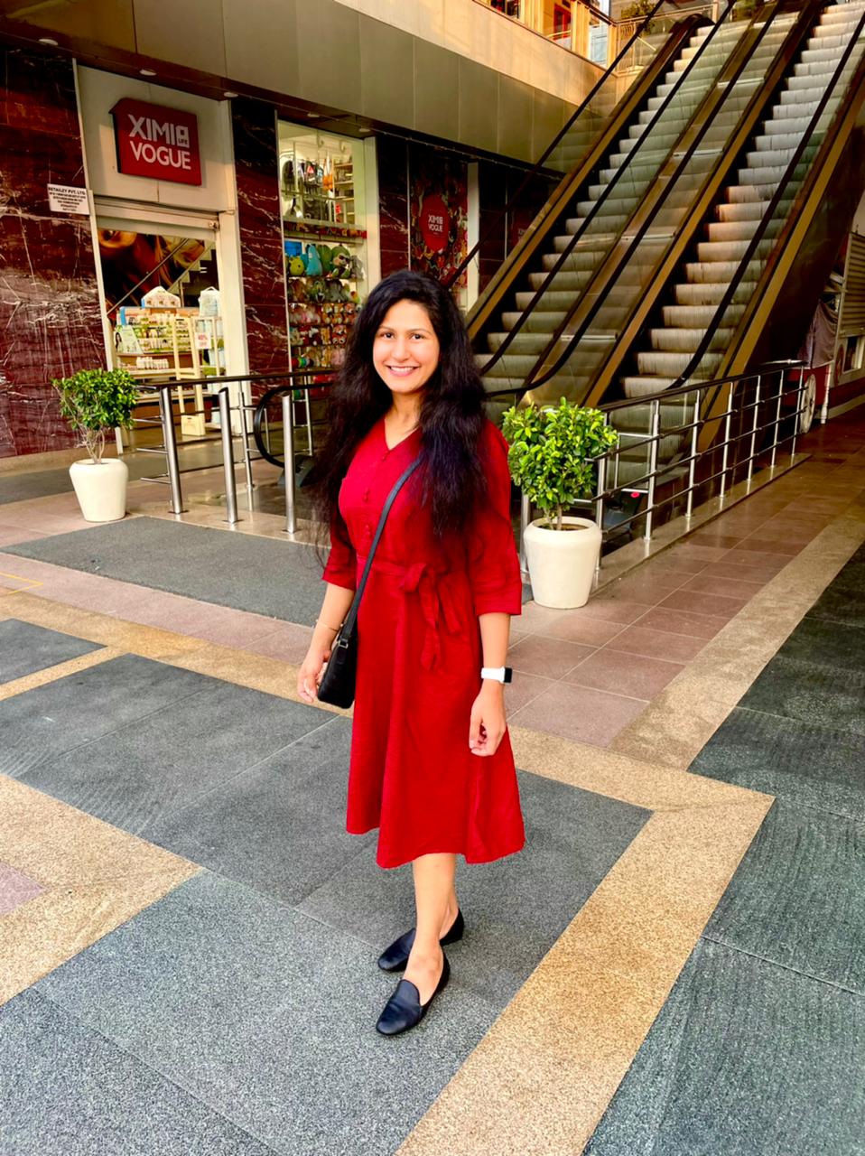
How to Wear Monochromatic Outfits
With the focus on just one colour, where can you go wrong? It is even more powerful on its own. you can go all monochrome or tonal as per choice.
While this colour combo may seem easy to master, there is a certain art that goes into finessing this look to prevent it from looking too mundane or flat. With any color on the color wheel at your disposal, monochromatic outfits are great for making a statement while keeping getting dressed easy. The key to mastering monochromatic dressing is to have a tonal mix of shades of the same colour in one look. Be sure to avoid pairing hues that are too contrary from each other; i.e. pairing a purple sweater that has cooler undertones with a purple skirt that has warmer overtones. If you keep that in mind when selecting your outfit, you’re sure to make an impact on your look without worrying about clashing.

Leave a comment
This site is protected by hCaptcha and the hCaptcha Privacy Policy and Terms of Service apply.